Freenow by Lyft introduces new refreshed brand look
Freenow by Lyft, a European taxi app featuring broad multi-mobility options, is announcing a significant brand evolution that consistently aligns its brand identity with the needs of drivers, riders and partners. This strategic update is designed to create an even more seamless and user-friendly experience for its millions of riders and drivers across more than 180 European cities. This marks the first change in brand identity of Freenow since 2019.
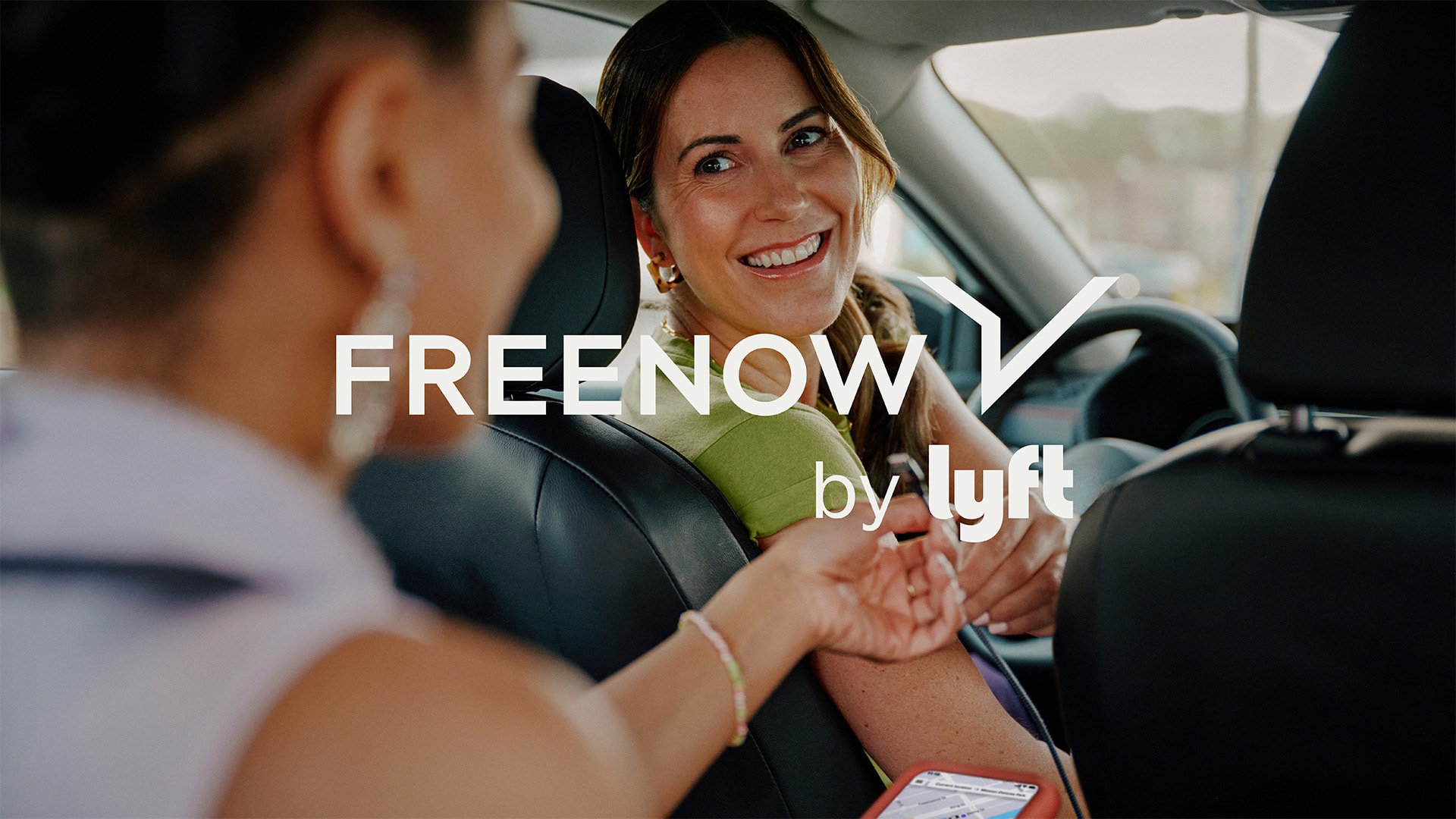
Freenow app users can already witness gradual changes to the Freenow logo, colours and overall visual identity. Since its acquisition by Lyft in July this year, "by Lyft" was incorporated into Freenow's logo, and now the Freenow visual communications itself has also been updated to clearly communicate its evolving services and values.
These changes reflect a commitment to connecting with the platform's community, with a refreshed icon symbolising the bond with bustling cities and the seamless journey through their roads to every desired destination, all made possible by Freenow and its deeply rooted expertise in taxis.
"We're thrilled to unveil this exciting brand evolution, which is more than just a logo and colour change. The refresh goes deeper to ensure we consistently connect with our customers better - beyond just verbal and visual identities," says Tony Fletcher, Global Marketing Director at Freenow. "Our core purpose is to be a taxi-first, multi-mobility app that you can truly trust. We believe these changes will help us articulate with greater clarity the convenience, reliability and safety that comes with an experience of Freenow. It's an exciting time for us, and we can't wait for our riders, drivers and partners to experience the refreshed Freenow.”
Some key features of the Freenow brand refresh include:
Freenow logo and icon change - an evolution of the existing wordmark, featuring refined and modernised geometries and lowercase letters, with an icon becoming a visual narrative of Freenow’s deep connection to the city’s road network and symbolising the seamless journey from point A to B.
The colour palette has been refreshed, leveraging the platform’s heritage red while introducing more subdued colours
New illustrations, showcasing human connection, reflecting Freenow’s customer-centric approach by incorporating more photography in communications to enhance relatability
New warm tone of voice: reinforcing Freenow’s trust and commitment to taxis, through caring clarity and confident expertise.
Brand evolution was an in-house project led by the Brand and Design departments of Freenow, with support from external agencies: Shuka was responsible for the logotype, sign and brand concepts and Lana for lifestyle illustrations.
Freenow will apply the refreshed brand across various channels and customer touchpoints, from its app and website, to marketing campaign assets and on-car advertising, throughout this year.
Freenow continues to solidify its position as a leader in the European taxi market and the wider urban mobility space. In July 2025, Freenow was acquired by Lyft, a global mobility platform. This acquisition is a significant milestone, allowing Freenow to leverage Lyft's expertise and resources to further enhance its services and expand its reach.